Most linkbuilders in 2026 still ask for the same thing: "send me a list, DR50+ minimum, no casino, no adult." Then the agency sends back a CSV, and three weeks later half the placements are penalised, devalued, or sitting on a domain that turned out to be a paid-post farm. Everyone shrugs. Everyone moves on. Same workflow next month.
DR is what the PageRank toolbar was in 2012 — a number everyone knows, nobody really trusts, and everyone keeps using as the first filter anyway. The reason it persists isn't that it works. The reason is that the alternative requires reading the page, which doesn't scale into a Slack message.
This article is about what you'd actually look at if you dropped DR tomorrow. Some of it you can do by hand. Most of it benefits from automation, which is what we built the Link Quality tool for. The signals are the same either way.
Why DR is the wrong metric (and always was)
DR is calculated from one input: how many referring domains a site has, weighted by how many referring domains those sites have. That's it. It's a recursive backlink count. The original idea — links as votes — came from PageRank, but Google moved away from raw link counting somewhere around 2012, and they've publicly distanced themselves from any pure backlink-graph score for years. Even Ahrefs's own documentation notes DR isn't meant to be used as a ranking authority indicator on its own.
Three things follow from how DR is calculated.
First, it can be inflated. There's a whole gray-market service category for "DR boosting" — for $50 to $200, someone will run a tier-2 PBN at a fresh domain and push it to DR50 or DR60 in two to three weeks. The score is real in the sense that the backlinks exist. It's fake in the sense that no human reading the site would consider it authoritative.
Second, it doesn't see content. A pure scaled-content farm with no human authors, no original research, and 600-word articles all ending in one commercial dofollow link can have a DR of 70+. The metric has no signal for any of that.
Third, it doesn't see the patterns Google's last few updates were specifically designed to catch. The Helpful Content updates penalise unhelpful, scaled, search-engine-first content. The spam updates target link schemes, AI-generated mass content, and domain abuse. None of those are DR-visible. A site that's about to lose 80% of its visibility in the next core update has the same DR the day before as the day after.
If you were asked to design a metric that reliably correlated with link value in 2026, you would not arrive at DR. You'd arrive at something that reads the page.
What you're actually trying to detect
When I'm vetting a backlink prospect, I'm trying to answer three questions, in order.
Does this site sell links? If yes, the placement is at minimum risky, and at worst will get devalued or trigger a manual action. The honest answer to this question lives in the HTML and the content patterns, not in any score.
Will this content survive the next update? If the site's topic-level quality is low — thin articles, no authors, scaled output, banned topics scattered through the archive — it doesn't matter how good your specific placement is. The whole domain is sitting on borrowed time.
Does the link pass anything useful? Even on a clean site, a deeply-buried footer link, a generic anchor, or an outbound link surrounded by fifty other commercial outbounds isn't carrying meaningful weight.
DR answers none of those. All three are answerable from signals that exist on the page.
The signals that actually work
Here's what I look at, roughly in the order I look at them. Most of these are visible in HTML for anyone willing to scroll for five minutes. The tool runs them at scale on 50 sites in one pass, but the logic doesn't change whether you do it by hand or in batch.
Single-link article footprint
The most obvious tell. A blog post runs 400 to 700 words. There's exactly one external dofollow link, usually in the last paragraph or the second-to-last. The anchor is commercial. The topic of the article is loosely related to the linked product, but the connection is forced — you can almost smell where the brief ended and the writer's contribution began.
Sites with this footprint at scale, meaning more than 30% of their articles fit the pattern, are guest-post farms. They might have been a real blog at some point. They aren't anymore. DR doesn't care. Google's spam team does.
Sponsored markers
rel="sponsored" or rel="nofollow sponsored" in HTML. Disclosure text in the article — "This post is sponsored by...", "In partnership with...", "Affiliate links may earn...". A sticky disclosure banner at the top of every post.
If a site has 40+ articles with rel="sponsored" already on them, it's not a gray area. It's a link seller that's been transparent enough to mark its commercial content. That transparency is good for them — Google won't penalise them — but it also means your placement, if dofollow, is sitting next to forty disclosed paid posts and Google knows the address.
Author diversity (or its absence)
Open the author archive. Count the authors. Read three of the bios.
A real publication has somewhere between 5 and 50 named writers. Each has a bio with credentials, a LinkedIn link, a list of publications they've written for. A scaled-content site usually has one of two patterns. Either every post is signed "admin" or "editor" or the brand name. Or there are 100 different authors, each with one to three posts, and every bio is a one-line generic — "John is a passionate writer interested in tech and marketing."
Both patterns kill E-A-T. Google's Search Quality Rater guidelines have been explicit about authorship since 2018. A no-author or fake-author site can't demonstrate expertise on any topic, and content from those sites is exactly what the December 2022 and March 2024 updates were built to demote.
Anchor entropy
This is the one I find most underused. A natural outbound anchor profile follows a recognisable distribution:
- Brand anchors (the site name, the company name): roughly 40-55%
- Naked URL anchors: roughly 15-25%
- Generic anchors ("click here", "this article", "read more"): 10-15%
- Partial-match anchors (containing one or two keyword fragments): 10-20%
- Exact commercial anchors ("best CRM software", "buy mattress online"): 1-5%
When the commercial anchor share jumps to 25-40% across the site's outbound profile, you're looking at paid placements. Not maybe. Almost certainly. No real editorial process produces an outbound anchor distribution that commercial-heavy.
Deep linking patterns
A normal site with editorial outbound links links to whatever is most relevant — a product page, a blog post, a study, a news article, a homepage. The distribution covers many URLs on the target domain.
A link-selling site links almost exclusively to homepages or to one or two specific commercial URLs, repeated. The slug pattern repeats. The anchor often matches a money keyword for the target. When you see the same commercial slug coming up across 20 outbound links to different target domains, you're looking at a placement template.
Topic coherence vs. banned topics
A cooking blog that has casino articles in the archive. A B2B marketing site with three CBD reviews tucked into a "lifestyle" category. A travel blog with a sudden cluster of online-pharmacy guest posts dating to 2023.
Every link seller with a multi-topic site eventually lets the mask slip. The articles are still there. Google's spam team has a much easier time finding them than you do.
Why we score these separately, not as one number
When we built the tool, the first thing I argued against was a single blended quality score. Single scores look clean. They sell well. They also hide where the problem is, and that's their main feature for tools that want to look authoritative.
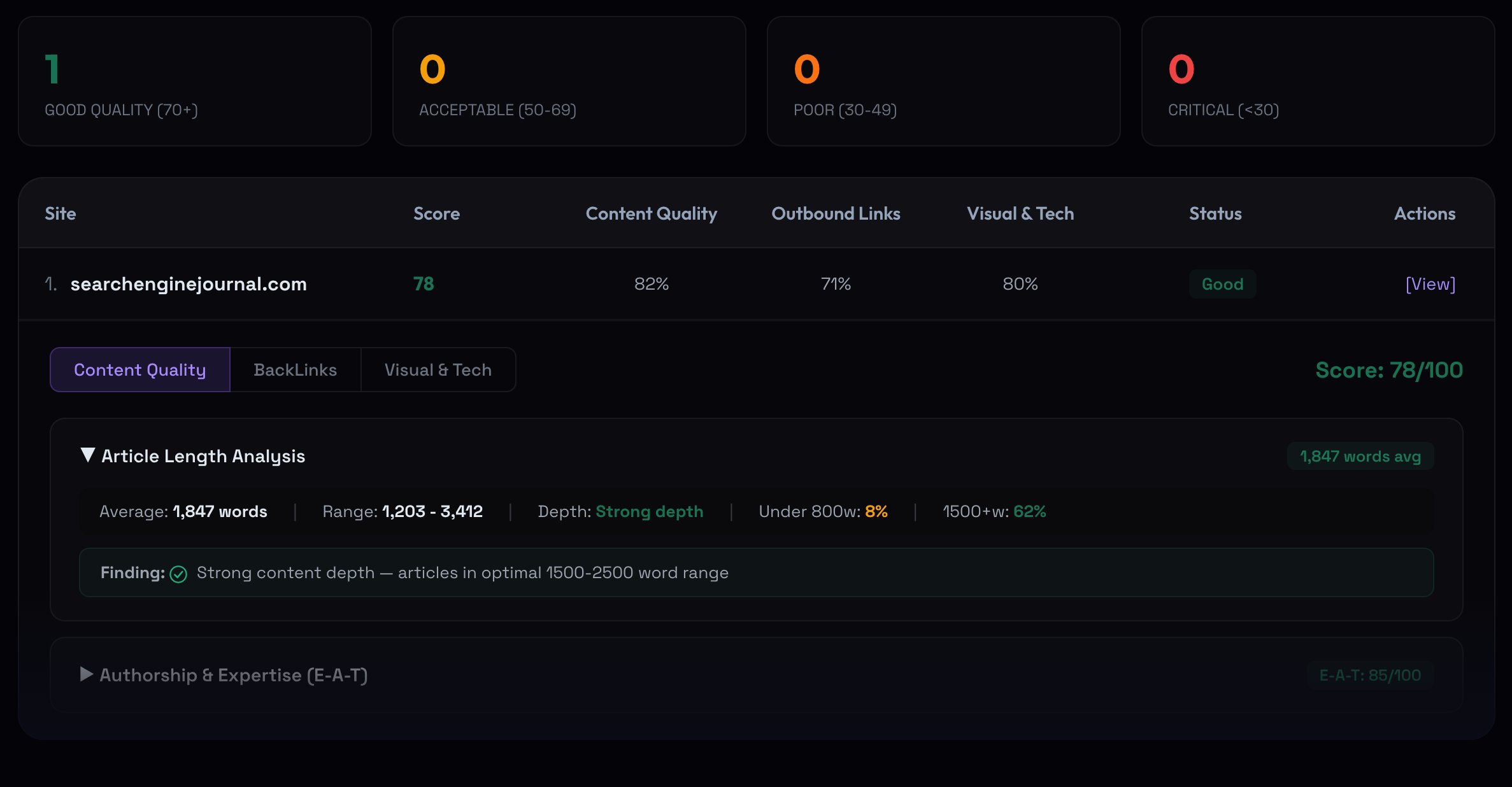
The screenshot above shows the alternative: three separate scores. Content Quality covers article depth, authorship, E-A-T proxies, topical patterns. Outbound Links covers commercial anchor concentration, dofollow ratio, anchor entropy, deep-linking patterns, sponsored markers. Visual & Tech covers CMS, theme reuse, mobile rendering, infrastructure signals. Each one reports on its own scale, with the underlying findings exposed.
The reason this matters: a site can be technically clean — modern WordPress, fast load, mobile-responsive — and still be a content farm. A single blended score might come out at 65, which sounds borderline, when the reality is Tech 88, Content 41, Outbound 60. Those three numbers tell you exactly what's wrong. The blended 65 doesn't.
The other way around happens too. A site can have weaker tech (older theme, no schema, slower load) and still be a high-quality publication with strong authorship and editorial standards. Blending pulls the score down for the wrong reason. Splitting tells you the truth.
Three modes for three different jobs
The tool has three analysis modes, and they exist because vetting a single domain is a different problem from vetting a network is a different problem from vetting one specific section of a site.
Domain Check is the bulk mode. Paste up to 50 URLs, get a quality breakdown for each in one pass. Up to 50 articles get parsed per site, so the signal isn't based on a single page. This is the mode you use when an outreach agency sends you a list, or when you're auditing your own existing backlink profile and want to see which placements have aged badly. Output is a sortable table, exportable to CSV.
Section Deep Scan is for guest post outreach. The case where you don't care about the whole site's quality — you care about the specific section your post would land in. Paste any article URL, the tool detects the parent section through breadcrumbs and category links, and analyses just that section in depth. Often a publication has one excellent vertical (their tech section) and one that's been monetised heavily (their "lifestyle" section). The site-level score won't tell you which is which.
PBN Detector is the most specialised. Single-site mode runs a focused PBN audit — banned topics, over-optimisation, E-A-T gaps, topic coherence, infrastructure fingerprints. Multi-site mode (paste 2+ URLs) does network analysis: shared hosting, IP block proximity, overlapping outbound links, cross-promotion patterns, temporal posting overlap. If you suspect a list of domains from a link seller is actually one connected network, this is the mode that confirms it.
Pick the wrong mode and the result is technically correct but not useful. Bulk-checking a section URL works, but you lose the section-level depth. PBN-checking a clean editorial site returns "no signals found" — which is true but uninformative. Choose by the question you're trying to answer.
What this tool deliberately does not do
A few things we left out, on purpose.
No DR or DA score. They're available through third-party APIs and we could surface them in five minutes. We don't, because including them would make people use them, and the whole methodology of the tool is the argument that those numbers mislead more than they help.
No traffic predictions. Tools that show "estimated organic traffic" are guessing — sometimes from clickstream data, sometimes from SERP visibility models, sometimes from pure regression. The error bars are wide enough that the number is decoration. Even Google can't predict what its own algorithm will rank tomorrow. We don't pretend to either.
No single blended score. Already covered. Three separate dimensions, exposed.
No "insider Google" claims. Some link-quality tools market themselves as having access to leaked or proprietary signals. We use what's in Google's published guidelines, the Search Quality Rater documentation, and the patterns observable in HTML and link graphs. That's enough. If a tool promises more than that, ask them where the signal comes from.
This positioning isn't free — it costs us users who want a one-number answer. The trade we made is that the people who do use the tool can verify what it's telling them, which matters more on a vetting workflow than it does on a dashboard.
Worth flagging that this article ties into the SEO Audit framework — backlink quality is one of the four audit pillars there, and it's the pillar most likely to surprise an in-house team that hasn't looked at their own outbound link patterns recently.
What to do in the next hour
If you have an active outreach pipeline or a recent backlink list from an agency: pick ten domains. Open each one. Scroll three random articles per site.
Two questions for each:
Is there rel="sponsored" anywhere in the article HTML, or a disclosure banner in the header or footer? (View source, search for "sponsored" — takes ten seconds per page.)
Are the articles all the same shape — short, similar length, with one external commercial dofollow link near the end?
If the answer to either question is yes for more than two of your ten domains, the list isn't worth what the agency is charging. The DR60 average doesn't change that.
The harder version of this audit is what the tool automates — anchor entropy, author diversity, footprint clustering, network signals. Those don't show up in a five-minute manual scroll. But the two questions above catch about half of the obvious problem domains, and that's enough to start asking better questions of whoever sent you the list.
The hard part isn't finding the signals. The hard part is being willing to throw out a list you already paid for.